 |
Articulos |
 |
Una mirada al Festival Verdad 2003 y 2004
¡Abajo injusticia, arriba verdad! Una mirada a las ediciones pasadas del Festival verdad, toda una fiesta a la verdad salvadoreña.
El panteón de la mentira
29/04/2005
Guillermo Berríos
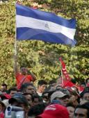
La verdad tuvo su fiesta en el festival de la UCA de este año. Panteón Rococó fue la bailarina principal. Se conmemoró el aniversario 25 de Monseñer Romero y el compromiso social existente por esclarecer las muertes en la guerra civil de El Salvador.
La edición 2005 del Festival Verdad de la UCA fue todo un agasajo a la conciencia y, como su nombre lo dice, al compromiso social.
No fue sólo un festival que reunió a los artistas de trova y canto latinoamericano de mayor renombre, sino que nos brindó la oportunidad de bailar con el rock y ska latino que ejecuta una de las mejores bandas en la actualidad: Panteón Rococó.
Con una masiva asistencia de 6 mil personas, el concierto dedicado al martirio de Monseñor Romero, Katya Miranda, padres Jesuitas, entre muchos más mártires que fueron asesinados a sangre fría en la guerra civil salvadoreña.
Casos que aún no se han resuelto y que festivales como este exige un poco de compromiso por parte de las autoridades competentes para que se solucionen.
Los aztecas imprimieron todo su power latino con canciones como "Cosas del ayer", "Esta noche" y "La carencia" (entre las más famosas).
El vocalista, mejor conocido como "el Dr. Shenka", a pleno concierto hizo un juego de tolerancia entre el público al cual lo dividió entre izquierda y derecha. Luego hizo que la izquierda se uniera con la derecha y viceversa, dando un mensaje de aceptación y trabajo mutuo.
Cuando hablamos con el grupo, todos se sentían satisfechos de haber sido parte de un evento con sentido humano, que toca los entretejidos de la realidad social.
Como dijo su trombonista y corista, "da gusto estar en tierras que han sufrido tanto, y que ahora celebran de manera positiva ese sufrimiento para cambiar las cosas".
Se vivió también la intensa e importante presentación de se presentaron en el festival fueron: Marimba Alma, India, Mayas, Signo Azul, Douglas Arévalo, Melissa Oliva, Trova, Son 3/4, Exceso de Equipaje, Karla Lara (Honduras), Alejandro Filio (México), Adrián Goizueta y Grupo Experimental (Costa Rica), Norma Helena Gadea (Nicaragua), Luis Enrique Mejía Godoy (Nicaragua).
El Festival Verdad ya lleva ocho años desde la primera vez que vio luz pública. Y es una voz al cielo que grita que 25 años de impunidad son suficientes para una sociedad que todavía sufre las consecuencias de la guerra.
FESTIVAL VERDAD 2003
2005-04-24
Oscar Leiva
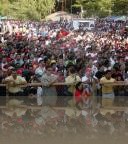
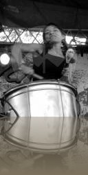
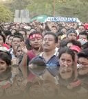
Miles de personas dijeron presente a la celebración del FESTIVAL VERDAD 2003. Uno de los conciertos que se ha convertido en los últimos años en sinónimo de un grito por la justicia, derechos humanos, la cultura de amor y de paz para El Salvador y el mundo.
Al evento se dieron cita los reconocidos exponentes nacionales Talticpac, Exceso de Equipaje, Son Tres Cuartos, Juan Carlos Berríos, Lil América y Tato Henríquez. Esta vez el festival tuvo la participación de grandes músicos internacionales de la talla de Adrián Goizueta (Costa Rica), Quinteto Tiempo (Argentina) y Luis Eduardo Aute (España). Música.com.sv te presenta este relato fotográfico del evento.
El público tuvo que soportar un retraso de dos horas para escuchar las primeras notas musicales. El tiempo fue aprovechado por los organizadores para recordar a mártires salvadoreños como Monseñor Arnulfo Romero (asesinado en 1980 por fuerzas de extrema derecha), La masacre de seis sacerdotes Jesuitas de la UCA y dos empleadas (1989 a manos de ejército salvadoreño) y de casos símbolo como el de la menor Katya Miranda asesinada hace unos años, crimen que como muchos otros en el país ha quedado en la impunidad. En el evento se recolectaron firmas para volver a reabrir este caso... una acción por la justicia y por la verdad.
En el ambiente también predominaba un claro sentimiento antibelicista. Cerca de 2,000 personas protestaron en contra de la guerra en Irak.
A pesar de que nuestro presidente y ciudadano Francisco Flores comprometió la voluntad de todos los salvadoreños dándole apoyo al mandatario Estadounidense George W. Bush muchos otros ciudadanos se pronunciaron en contra de la invasión norteamericana contra el pueblo de Irak, Afganistán y otros conflictos mundiales adonde han ejercido un importante rol guerrerista e intervencionista.
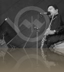
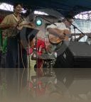
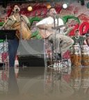
La música sonó hasta alrededor de las 5:00 p.m. pero la espera valió la pena. Alternaron varios exponentes de la trova salvadoreña entre ellos, la gente de Exceso de Equipaje (en la foto), Talticpac, Son Tres Cuartos, Juan Carlos Berríos, Lil América y Tato Henríquez, compatriota salvadoreño residente en México. Pequeños, adultos y ancianos disfrutaron de un buen espectáculo.





Comentarios
| ttesting76 | 24/07/2015 - 11:28:21 pm |
http://www.nikevertu.com2014 mobile interface design new trend How much do you know? Baidu cloud UE responsibleelya girl: If you are a fanatic APP, you will spend a lot of time in a variety of APP's early adopters, you will obviously feel some of the APP in the use of a certain style of distinctive design language, to flaunt their unique form their own design style, even leading the design wind. Last year, we are concerned with the Metro design style effects and iOS7 release, APP clearly have begun to try to flatten design language, and in addition, what externalization language emerge it? Source: excellent set net Author:elya girl in this article, I would like to share some of the increasingly dominant language, people look to remember its style, some have excellent designers with exploration, into product design in the domestic mobile, and some, indeed just in its infancy, needs further exploration and try. First, the only primary colors | Simple color schemes Why do we want to define an interface multiple colors? Using only a primary color, it is not able to express good interface level, important information, and to show a good visual effect? In fact is true, with the release of iOS7, we see more and more the only main color style design, it will use a simple color scale, and the supporting information to show grayscale levels, but never use more colors . Qatar Airways Qatar Aviation is one such design case, the entire interface with the main colors of pink, from the title bar to tab to prompt information from the operation buttons, in addition to black and white ash, all pink design, this profile of color style, and have actually pla[censurado] a very good message across effect, but also has a good visual expression, designer skills in the content layout is really a plus. Readability design with red primary colors, even the message background color, linear buttons and icons are used primary colors red, interface and LOGO are solely a color. And Vivino primary colors with blue design, information to be separated by dark blue, light blue. Eidetic main colors in orange design, one of the key action buttons brighten even the whole orange, dark orange message icon is also used, to express the degree of light orange. You can say the only main color design techniques, is really done to minimize mobile terminal APP (Minimal) design to reduce interference redundant information, allowing users to focus on the main access to information. Second, the multi-colored | Hypercolour formed with a single master tone control relationship, Metro is leading the multi-color style, why do I have to give my own product definition on a main color, more color can not be the main color it? So there is a different Air Jordan 19 page, different chunks of information using hit-color multi-colored way to design the style, even with a local interface can use colorful hit color, also produced a lot of good design. Uniqlo produced RECIPE, is a bright spots in the design case, multi-colored design style into the entire APP, whether switching tabs or scroll content chunk, a different theme will change color. When the color switch, there will fade effect, so that the switching becomes natural, completely stiff. RECIPE Pomodoro timer module, will be timed while exquisite cuisine while playing background music, but switch to a different body colors, along with body color change, the prospect of all copy, pictures will be changed to the color, add clear a high degree of food pictures, is really twofold enjoy the visual + hearing. RECIPE 2013 really is a rare good design. The Peek Calendar, EveryWeather and Harmony three APP, is a list of multi-colored design case, this list of multi-colored, do not know from the start resurgence Clear stand up, with bright multi-colored to distinguish information really can play to highlight the effect, very eye-catching visual. But for some content-based APP, may not apply, such as GoogleKeep colorful card is indeed in the content reading will play the opposite effect. Baidu cloud Notepad first edition design is multi-colored, but then more consideration to text notes, to provide a good experience to read the text, or change the multi-colored off-white micro-textured design. Third, the Air Jordan 14 Retro data visualization | Data Visualization As for the presentation of information, more and more began to try APP data visualization, infographics, let the interface is not just a list, and more intuitive pie charts, pie charts, line type , histogram, and so rich in expression. Seemingly not a difficult thing, but if we really want to achieve, the complexity of the underlying can not be a small glimpse. Nice Weather expressed by the graph of temperature change, Jawbone UP histogram to express the daily completion, PICOOC with a line graph to express the change of body weight per day, body fat. Mobile APP use data visualization can be in a smaller screen space, more three-dimensional display of the content. Fourth, the card of | Cards card is also a form of design language used more, this card can not be elegant design that is po[censurado]r from the Metro tiles, or stream from Pinterest po[censurado]r waterfall. In short we can find, Google's mobile terminal has a comprehensive product design of the card, or even Web also follows the end of this unified design language, is said to be head of Google search experience to lead a unified design language upgrade. luvocracy cards flow highlighted the information itself, with big picture and caption text to attract users, and strengthen the endless browsing experience to attract users to have to scroll down. Google Now cards are more customized and personalized. Some cards are used for user education, and some cards are used to tell the weather, some cards are showing the contact list, a little card is displa[censurado] backlog. Different cards have followed within a unified width and style of card, and the design and realization. Both to ensure the independence between the card and the card, but also to ensure the unity of design services and services. Shazam is a card with an interesting style, presenting songs and albums. Fifth, content is king | Content Air Jordan Others FirstAPP product development, and ultimately bound to follow the path of web products, outstanding content, content is king, when the bustling faded, spotlessly clean, and re-look at APP meaning of existence, no more than It is to provide better service. Compared with the content, all the design and packaging, are nothing more than a manifestation of the way, while APP real value, must be content to win. Facebook with 19 billion dollars acquisition of Whatsapp, the whole control system built with APP, not because of his more outstanding design, but because of his service valuable enough. Artsy images of waterfalls flow, did not use the line and face to distinguish the information block, and that is to do with the content itself layout, users can more concentrate on image content. Prismatic use of typography, content front as much as possible, weakening the icons and operations, allowing users to focus more on the content read. The MR Porter will use product images, names and prices to do the design, allowing users to focus on the product itself. Six Nike Basketball round use | Circle Design circular is most likely to make people feel comfortable shape, especially in the mobile phone screen full of blocks, add some rounded shape embellishment, will immediately increase the lively atmosphere, only increase goodwill. An interesting phenomenon that, iPhone dial the numeric keypad, a start is rectangular design iterations to iOS7, have become a circle, can be said to be a tribute to the traditional phone, it can be said to enhance the soft feel interface. Of course Accordingly, we need to address the real point of the circular contact area, not because the design into a circle hit area is also smaller, resulting in decreased accuracy click, aesthetics enhance usability is affected. Beats Music to select your favorite label design became circular, which lists more than ordinary, rectangular tag feeling much better, more interesting and more exploratory. Movse walk daily Nike Air Max number of steps, calories are circular bearer, data visualization, key information dominance of the best cases. Tumblr put to create the type of content choices, with a circular mask layer + option button design, so choose to become focused and clear, not so rigid. Seven Perspectives background | Pictures Bigger Vision image background with a banner as a backdrop, has become a po[censurado]r trend this year, either as a whole APP background, or as background contents of those blocks, both to enhance the visual performance efforts, APP also enrich the emotional element. Some information or operations, floating on the picture. This design approach, font and layout design requirements are higher, but also more difficult, but very easy to render the atmosphere. Perspectives background style is also divided into two types, one like Secret, The Whole Pantry such content block background with large field of view, the benefits can use the pictures to make the block segmentation, the difficulty is not the effect of image spliced must look good, you may also need to meet strokes, and other design tools to optimize stitching blank. Another just want Vsco, Flink, Mindie, Soundwave this, full-screen background image even get through the status bar, the prospect of doing content layout, navigation, operation. Benefits are nike dunk heels designed very life, so a friend to this style is also called a planned design, that is the return to nature of design techniques. But the risk is very clear is that the arrangement of information design is a great prospect of actually challenging, must p[censurado]through the colorful background interference attention too, resulting in text readability prospects will become weaker. They are required to operate with clear buttons Nike Shoessignificant segment out and read type text with background use obvious anti-color, or not, then put the text to float on a translucent mask layer, readability problem solving. It concluded, in 2014 I think is impressive seven languages, the only primary colors, multi-colored, data visualization, card, content is king, and a large field of view using a circular background. In fact, very difficult to have a new design, but also a continuous cycle process, is to highlight the contents of APP in the direction of light and thin design, but Paul allowed someday, they subvert the weight back to the beginning of the texture of the proposed design was saying it. |
|

-
Victimas
El Parke -
DEBIL ESTAR-ME ACUERDO
Debil Estar -
Autopisteando
Adhesivo -
Cariñito
Shaka y Dres -
Ciclon
La Moda -
Cuando te veo
Frigüey -
Letritas de Amor
R.E.D.D. -
Mentiras
Prueba de Sonido -
Nada Tienes
Eskina Opuesta -
QUISIERA SER
Grupo MELAO de El Salvador -
Terror.sv
Vibora -
Viento Solar
AKUMAL -
Yo quiero ser
Xavi Lara -
Yose
Mr. Pelón (503)
